
Why some users hate their SAP User Interface / User Experience and how to fix it
Why some users hate their SAP User Interface / User Experience and how to fix it.
In this blog post I hope to address one of the most unfair and unrealistic criticisms levelled at SAP today: the user interface is terrible.
As SAP consultants, this is a common gripe and one which often filters its way up to the upper echelons of an IT organisation and puts CIOs off from selecting SAP as an ERP. So really, is it that bad? How on earth can it be so terrible given that SAP holds a commanding 22% of the ERP market place – double that of its nearest bitter rival, Oracle?
Let’s break down the reasoning behind such assertions:
1. Most user’s experience of SAP is embedded deeply within the traditional SAP GUI screens – something like the below:
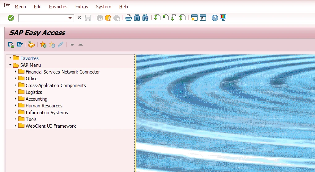
Back on 6th July, 1992, when SAP R/3 launched with this user interface, the screen was pretty revolutionary and met with widespread awe in the marketplace. SAP very quickly came to dominate these early years of client-server computing. Despite SAP undergoing several version revisions - including a major repositioning in 2004 with the launch of SAP ERP Central Component (ECC) - the SAP user interface remained largely untouched for many years. SAP has flirted with web portals through their NetWeaver technologies in the early to mid-2000s, but with little take up of the technology. It was not really until S/4HANA arrived on the scene in 2015 with its free-to-use web based user experience, Fiori, that the SAP user interface was dragged into the 21st century.
Having said all that, most SAP users are still wedded to their SAP GUI, as pictured above. This means that they are using an interface which has barely changed in 28 years.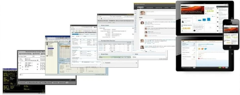
The SAP user interface journey from R/2 right through to SAP Fiori.
If you were using a 28 year old television, I suspect you would think it to be pretty terrible, right?
2. Many SAP clients have diverged from standard SAP in a radical way.
Most end users, unless they have prior experience of working with SAP, are unaware of this and believe that the SAP user experience they have is the standard SAP view. Nothing can be further from the truth. An average SAP installation can have hundreds or even thousands of customized enhancements within it, which make the overall user experience very different from the standard SAP approach. In many instances, a better designed offering is available in a later version of SAP which has not been installed. However, rarely does “user experience” convince an organization to part with its cash to upgrade, and so inferior user models are often built. These models are then built upon and built upon as years go by until the overall experience can be almost unrecognisable from standard SAP.
3. Building on the previous point about customisation of SAP, it is important to note that the traditional approach to customisation does not really feature important design considerations.
Having worked in countless SAP implementations, the design and drafting of new transactions and reports rarely takes account of design standards, ergonomic considerations or usability. Too often, the customisation approach is rushed and with the end goal as the main focus. The journey of reaching that end goal, the full experience and user satisfaction is almost never a consideration. For example, a report can be built which suits the person who is asking for it perfectly. This report is then used in a business for years to come, long after that specific person has left the organisation or moved to another role. The design of the report then becomes a subject of constant criticism by subsequent users who had no experience of the process in question. In other words, what was intuitive for the expert is baffling for a less experienced user. 

Are you an expert user or a confused user?
So where do we go from here? What tools are available for new SAP deployments to ensure that they comply with good design practice and delight the users?
Let’s start from the beginning. When you download an app on to your mobile device, does it come with a training manual? No, of course it doesn’t – the app is intuitive enough for even the most technically challenged person to use. Right so here is your starting point. Clearly for complex ERP systems such as SAP this is not necessarily realistic, but let’s aim for the stars. The SAP Fiori user experience, combined with SAP Screen Personas gets us some way of the way there – more of that later.
To get somewhere approaching this nirvana, you need to reimagine the workplace from an end user perspective. This is not a quick task, but can be achieved through a detailed “Discovery” phase in an SAP project. This should involve work shadowing with key users and detailed interviews to understand pain points. Always keep your eye on the prize – what is the end goal of the process in question and how can you guide your user to get there as quickly as possible without compromising on quality? How would a brand new user without any experience cope with the process? Help is at hand from SAP to achieve this:
SAP Fiori Elements
SAP explains these as the “production line for UIs”. In its most basic form, these are a set of smart templates which can be used for any type of Fiori app. The templates are based on the type of app required and there are five different types:
Overview page – example below.
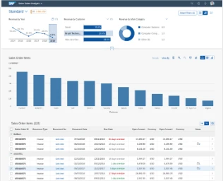
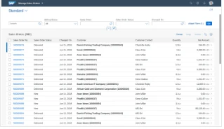
Analytical list page – example below:
List report page – example below:
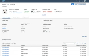
Object page – example below:
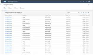
Worklist – example below:
Each template has been designed by SAP in strict adherence to the Fiori principles of usability, efficiency and beauty. These “floorplans” as the templates are known as, can be used as a template to build up the kind of app your user will require. It soon becomes clear that if all the Fiori apps follow the same guidelines, then the consistency becomes very comfortable and recognizable for users. It also drastically reduces the amount of coding required to develop the app. More information can be found for Fiori elements in the link below:
https://experience.sap.com/fiori-design-web/smart-templates/
SAP Build
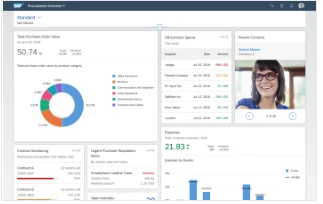
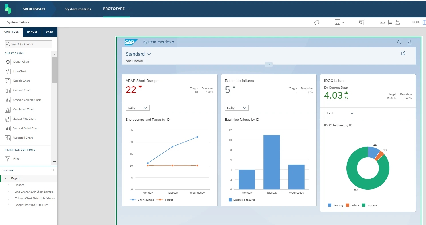
This is a free tool and can be invaluable for building apps and continuously checking the design with the end user. SAP Build allows you to drag and drop standard icons and elements onto a Fiori screen to show the users what an app might look like, suing Fiori design elements. This can be extremely useful in investing your users into the project – if they have a say in the specific design and look/feel of the end result, they are far more likely to be careful and thoughtful and end up being an evangelist for your work. I have created an example of the kind of Fiori screen you could create in Build below, to show a system monitoring page.
SAP Screen Personas
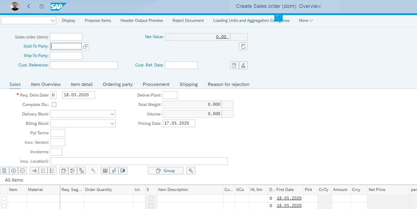
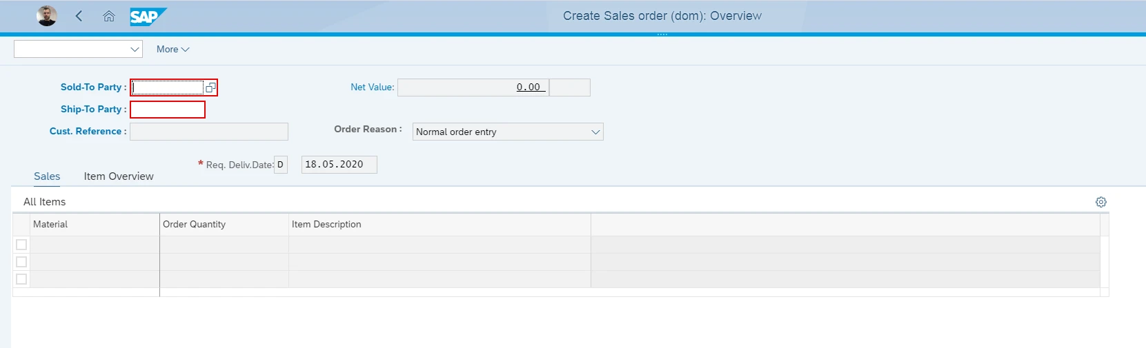
If you find that certain SAP screens do not suit your end user requirements, instead of rebuilding from scratch (the old method, now defunct) it is highly recommended that you use SAP Screen Personas. This is a free-to-use tool included with your licence which allows you to personalise the SAP screen in question. This is truly like gold dust and I implore you to use this. As an example, many SAP users complain that the “create sales order” screen (GUI transaction VA01) is far too complex for their business needs and their users only need to fill in perhaps 10% of the screen fields. No problem with SAP screen personas – simply hide all the fields you don’t like and move the required fields in to more appropriate positions. It may also be true that some users require fields that other users don’t – perhaps custom fields related to a specific organizational unit only. Again, no problem with SAP Screen Personas – you can assign specific roles to specific “flavours” of personas, thereby allowing maximum flexibility of user experience.
Example “Create Sales Order” original screen, before removal of many “unwanted” fields:
Example of same screen after removal of unwanted fields through SAP Screen Personas:
Conclusion
In summary, my message to you, is “do not settle for average”. If users or other stakeholders in your organization complain about the SAP user interface, feel free to fill them in on the cutting edge technology on offer, which means that no user has to be left behind. SAP has the flexibility with S/4HANA and Fiori - especially in combination with the Build and Screen Personas mentioned - to meet any user experience requirement and provide beautiful apps which will delight your customers!
Author: Jon Simmonds, Senior IT Architect
More Blogs


