A simpler and more intuitive UI for SAP S/4HANA Cloud
A simpler and more intuitive UI for SAP S/4HANA Cloud.
Ever since SAP R/3 was launched in the market, customers have embraced it with fervour for its rich functionality and water-tight integration, which solved huge challenges for large corporations. However, there has been high demand for a better UI than SAP GUI of the 90’s. SAP responded with SAP Fiori and later with the SAP Screen Personas tool. We discussed the SAP UX Strategy and S/4HANA implementation in an earlier blog. With SAP S/4HANA Cloud, SAP has made Screen Personas an integral part and enhanced it with rich functionalities to make UI simpler and more intuitive for user adoption.
In this blog, we will briefly look into some of the key functionalities and concepts of Screen Personas.
Classic Apps screen adoption in S/4HANA
In the context of adopting Classic Apps, SAP has provided the following broad category of tools and concepts:
• Concept of Flavour
• Functionalities for Merging Tabs, Simplifying tables and building templates
• Tools for Automation and building Flavours
• Administering Flavours
Improving user productivity by eliminating avoidable screens/ keystrokes/tabs, reducing training time with intuitive screens, and avoiding data entry errors are some of the key objectives of Fiori apps to enhance User Experience (UX). The SAP Screen Personas development team is part of the SAP UX Engineering team, paving way for Screen Personas as a critical part of SAP UX strategy. SAP Screen Personas are pre-installed into S/4HANA Cloud, as opposed to it being an add-on.
SAP Slipstream Engine is now a component of SAP Personas 3.0 SP06. It enables an alternate rendering approach to SAP GUI and SAP GUI for HTML. Its main purpose is to make screen rendering in different screen sizes of Laptops, Tablets and Mobile, without additional development effort.
Let’s look at an example of what a Classic Outbound delivery business process screen looks like. It is shown in exhibit-1 below. It consists of plenty of data in Main header, item header, item tables and user action buttons, etc. We will see how the new concepts and tools are enabling the simplification of such screens. 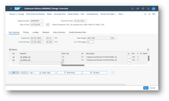
Exhibit-1 (Credits: SAP SE)
Concept of Flavour
Flavour is a variation of the screen for a specific user’s role and activity. This does not modify the underlying transaction, so that the benefits of standard cloud-based systems are retained. By “adapting the UI”, screen personas create a “change list” on top of the original screen that is interpreted at the runtime and the original screen remains unchanged. It is explained in the diagram below. Flavour Editor is the tool to create Flavours. We will see more about it going ahead. 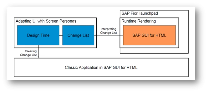
Exhibit-2 (Credits: SAP SE)
Creating the flavors is a team exercise. It involves Business Experts, Design/User Research Experts, End User, Flavor Builder, and administrator of Flavors. The first two roles are outside the system, while the last two roles are technical experts inside the system. The End User is partly on both sides of the system. It is shown in Exhibit-3 below.
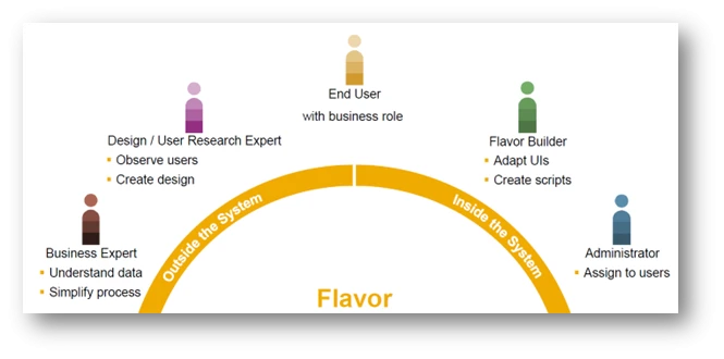
Exhibit-3 (Credits: SAP SE)
To understand the features of Tool, let’s use the outbound delivery screen as an example. The classical screen is shown in Exhibit-1.
Flavour Editor
Screen Personas “Flavour editor” is available in the user menu as “Adopt UI” option. This is shown in Exhibit-4 below. 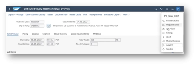
Exhibit-4 (Credits: SAP SE)
The editor has the following features and we will see some of them in the following sections:
• Hiding UI elements
• Rearranging UI elements
• Adding Custom fields or controls
• Defining events for process automation using scripts
• Styling adjustments
• Making adjustments for screen fitment into other formats like Tablets
Hiding, Rearranging, Adding Controls, Style Adjustments
Let’s consider the example of simplifying the header of the Outbound delivery UI shown in Exhibit-1 , as desired by a customer. Remember, the original SAP delivered UI is always preserved and we need to create a flavour on top of this. On choosing the “Adapt UI”, you will see the original and option to create a variant. This is shown in the diagram below.

Exhibit-5 (Credits: SAP SE)
Once Create new flavour is chosen, the original screen UI elements are presented with a menu on the top panel to perform any of those activities mentioned in features above. On choosing a screen element, the menu icons are activated. You may notice icons for Hide, Copy, Format, Sizing and so on. A variant named “Shipping Specialist” is shown in the diagram below. 
Exhibit-6 (Credits: SAP SE)
Remember all elements of original UI are only “hidden” and can’t be “deleted”. This is important from the point of maintaining UI element integrity with other elements, which it may have. See below in Exhibit-7, how the customer has hidden some of the UI controls. The place holder icon in purple shows the hidden elements. You will notice many are hidden.

Exhibit-7 (Credits: SAP SE)
The other tabs such as “Insert”, “Tables”, etc have relevant icons for performing related functions. It is shown in the diagram below. 
Exhibit-8 (Credits: SAP SE)
There is a feature called “Parking Lot”, which brings up a pop-window as parking lot. One can move the UI elements temporarily while working with screen design and then bring it back to the main screen. It is shown in the diagram below.
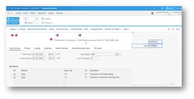
Exhibit-9 (Credits: SAP SE)
Now the “flavour builder” has completed hiding some of the UI controls, made font changes, moved some of them into different locations, added three buttons relevant for Shipping Specialist to have easy access of option to create notes (which was originally buried in one of the sub-menus of the classic application) and printing. The screen before saving variant looks as shown in Exhibit-10 below. 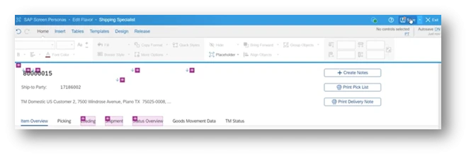
Exhibit-10 (Credits: SAP SE)
Upon saving and exiting the flavour tool, the created flavour of the UI looks simpler as the user wanted it. This is shown in the diagram below. 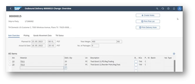
Exhibit-11 (Credits: SAP SE)
Merging Tabs
In classic applications, related set of info are grouped into one tab for relevance and ease of presentation/use by the user. Often the role using the application needs only a few of them, forcing them to switch between tabs to decide before further input is entered. For example, in our Outbound Delivery example (refer to Exhibit-1 above), there are tabs such as “Overview”, “picking”, “loading”, etc. The Tab Merging feature enables one to move controls from the original tab to other tabs, or even an entirely different container, and hide the original tabs to declutter the screen. This is also called “Screen Flattening”.
Merging tabs requires one to consider user requirements in each context and also the process validations embedded in flow of tasks. There are controls embedded in classic applications which will not allow users to move to the next tab. Some of the possible reasons are given below:
• Mandatory input field value not entered by user
• Validation error in certain input fields
• Warning or error messages in status bar
• Confirmation pop-ups requiring input from user
The merged controls from the “Invisible tabs” are not reachable by the user. It is the responsibility of the “flavour builder” to observe the business logic and take into consideration before merging the tabs. The typical approach to solve such challenges is to implement the tab scripting events like “OnMergeError” provided at tab script control. An appropriate script can resolve application specific merging errors that may come up. In our example of outbound delivery, the data validation error in the “Loading and Shipment” tab prevents user from moving out of “Current active” tab. The diagram in Exhibit-12 below shows this. SAP recommends minimising the number of merged tabs to balance the functional requirements and performance.
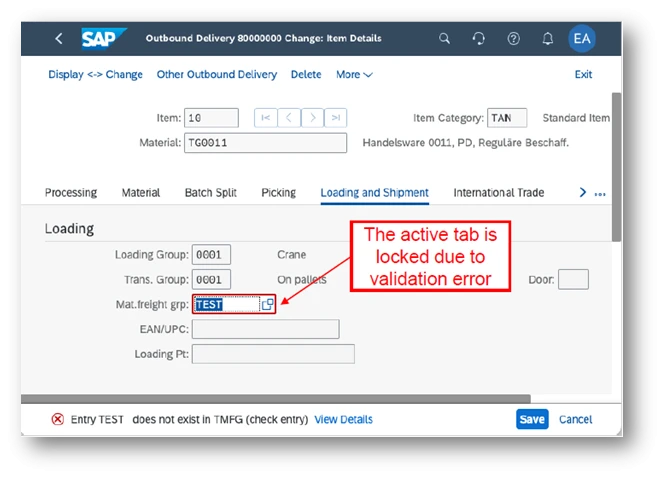
Exhibit-12 (Credits: SAP SE)
In our example of Outbound delivery scenario, the team has decided to move the following controls from different tabs to the main header of the screen to avoid the user switching between these tabs:
• Planned goods issue date and time from “Item Overview” tab
• Overall Picking status from the “Picking” tab
• Goods movement status from the “Goods Movement Data” tab
Note that the “picking status code” and “goods movement status code” are not shown in the header to simplify the screen as per study requirement decisions. Remember, the data nevertheless exists in the background. The revised header screen is shown in exhibit-13 below.

Exhibit-13 (Credits: SAP SE)
Simplifying tables
Table objects contain many columns and rows in classic application, with horizontal and vertical scrolling features. However, typically certain user roles do not have the need to use/update many of the columns and waste time in scrolling to locate the required data. Sometimes column width may not match the cell content, column headings can have a better description, unwanted table action buttons, etc. Hence, simplifying tables is a common requirement, when classic applications are adapted to a specific user role. An example of classic application table is shown below in exhibit-14. 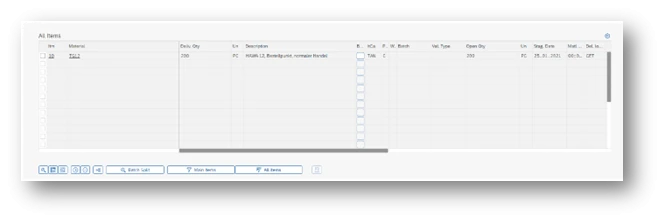
Exhibit-14 (Credits: SAP SE)
The “flavour tool”, provides for changing properties like table height, width, column width, hiding columns, changing column order and changing table and column texts, etc. Table width and height locks the table in that dimension. Table objects won’t automatically adjust to the browser window size. Number table rows can only be decreased from the backend definition. The team should consider these aspects while designing the UI flavour.
Let’s consider in our example, simplifying/adapting the screen for a shipping specialist role. Remember we have already hidden many of the tabs and only the three relevant tabs are retained. The screen shot below in exhibit-15 show the situation before adopting the classic table for this role.
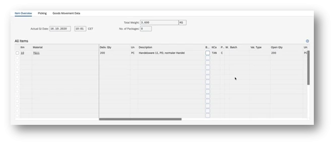
Exhibit-15 (Credits: SAP SE)
There are many columns which are not relevant for shipping specialist. Hence the columns are hidden. A screen shot of the same is shown in exhibit-16 below.
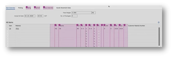
Exhibit-16 (Credits: SAP SE)
Even the action buttons below the table need adaptation. The screen shot below shows the set of buttons in the classic application and it has been adapted based on the study by the team.
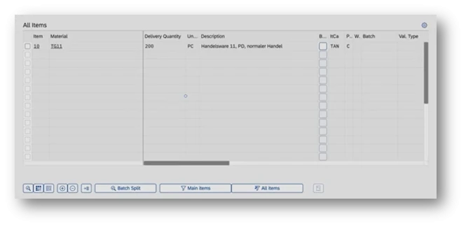
Exhibit-17 (Credits: SAP SE)
Based on screen guidelines, the relevant buttons (after hiding one) have been moved to the top and the final screen looks more simplified for the role. Note that there is no horizontal scrolling needed by the user. It is shown in exhibit-18 below.
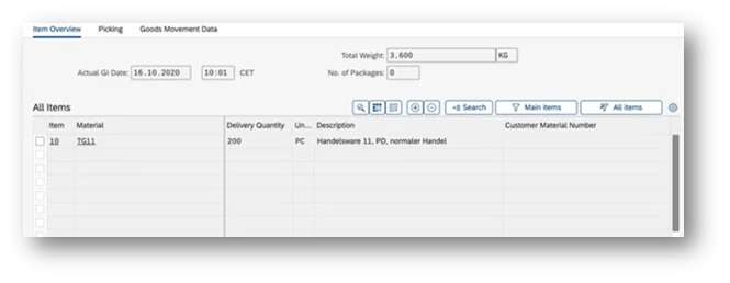
Exhibit-18 (Credits: SAP SE)
Templates
Templates help us to achieve a uniform appearance of screens so that user learning happens quickly and intuitively. Using templates, flavour creation and maintenance is simplified and accelerated. Templates can be applied to different sections of screens within an application or even across applications. Template editor is part of the flavour editor, as shown below, and also can be accessed from the flavour manager.

Exhibit-19 (Credits: SAP SE)
The templates are first created and then applied to the “item tabs” in our example. It has been decided by the team that each of the tabs will have one different line for the label and another one for three different field values. This is shown in the diagram below. This template will be applied across all three different item tab headers.
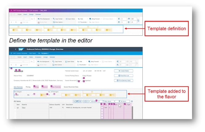
Exhibit 20 (Credits: SAP SE)
The existing item tab header looks like the one shown in the diagram in exhibit-21 below. They are not uniform and user experience can be greatly improved using this template.
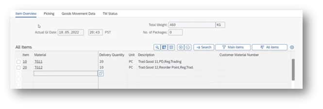
Exhibit-21 (Credits: SAP SE)
Now after fitting the data relating to “Actual GI Date” and “Total Weight” into the template, the screen looks like the one shown in the diagram below. The “Number of packages” details are not considered relevant for the role and hence hidden. The 3rd element in the template is unused in this case.

Exhibit-22 (Credits: SAP SE)
Now you see below in exhibit-23, how the screen looks easy and simple for the role of Shipping specialist after the template is applied and provides a consistent user experience to function effectively.
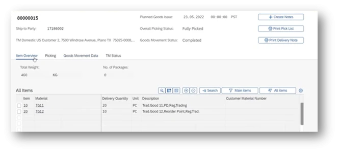
Exhibit-23 (Credits: SAP SE)
Tools for building automation and administration of flavours:
SAP Screen Persona has its own “scripting engine”. There is a recording tool available to generate JavaScript. Capturing manual interactions of the user, the tool can generate the scripts and it can be edited subsequently. The “flavour builder” role need not be an expert Java developer to build scripts from scratch. A full repertoire of features are available to generate, modify, test and maintain the scripts. In our example, the print picklist button typically runs a script in the background and generate the output document.
A script once made, can be used across multiple flavours. There is a concept of “Local Script” and “Global Scripts”. Global scripts can be used across flavours, Screens and Classic applications as well. Once a script is marked as “Global”, the type can’t be changed. The changes to the “Global script” affects all the flavours that has referenced it in their processes.
Using events, a script can be triggered. There are “Screen events” and “Script events”. Script events are generally tied to a single control within the screen. Examples of script events are “OnClick”, “OnSelect” , “OnMergeError” and so on. It must be noted that not all script events apply to all controls. On the other hand, Screen events are typically tied to a “page lifecycle” . Examples of screen events are “OnEnter”, “OnLoad”, “OnAfterRefresh” and so on. For example, the colour of the picking status can be shown in red, as shown in exhibit-24, using the scripts. A piece of the code is shown in the scripting window at the lower part and result in the upper half.
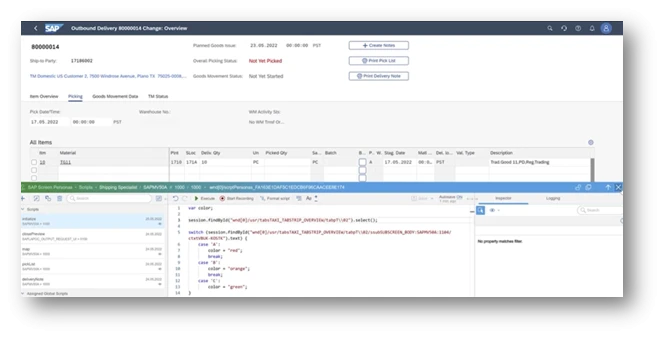
Exhibit-24
In reality, there are many different devices of varying screen sizes that are used to accomplish a task. Adaptive flavours, means a flavour definition for each similarly sized device. There is a concept of “Parent” and “Child” flavours. Once a flavour is created, one can add an “adaptive flavour” to the parent. It is required to specify the minimum width for each adaptive flavour, for the system to pick the right one in the given context. Child flavours have an additional layer on top of the parent flavour, essentially the delta changes. It even over-rides the changes in parent flavour. The “Flavour Builder” must consider many aspects before determining the size of the screens. An example of how an adaptive screen size is mentioned in the tool is shown below.
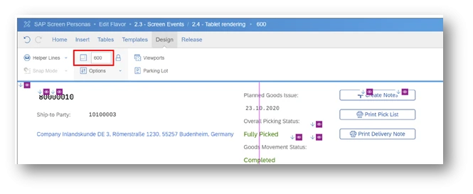
Exhibit-25 (Credits: SAP SE)
Administering Flavour
SAP has provided all the necessary tools to assign flavours to business roles, moving flavours from development to production, settings for further fine-tuning of authorisation for a given context, and so on. Exhibit-26 below shows a snapshot of some of them.
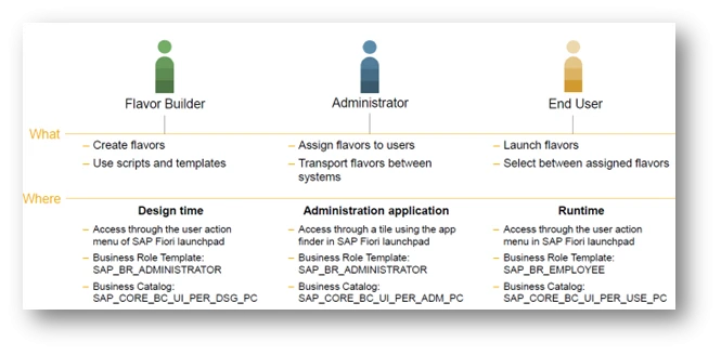
Exhibit-26 (Credits: SAP SE)
Summary
Screen Personas has been in vogue for quite some time as an independent tool. Few customers have used it to adapt UI screens. With the current integration in SAP S/4HANA Cloud, it enables customers seamlessly to create, administer and maintain them in an efficient way. This is a great tool and SAP has effectively addressed the customers' demand for a better User Experience.
Author : Ravi Srinivasan, SAP Alumni

References:
• SAP HANA Cloud- Home Page
• Screen Personas - Documentation
• Slipstream Engine
• SAP Screen Personas Community
• Rendering Screen Personas on mobile devices
• Screen Personas – administration
• UI5 Guidelines to create adaptable apps