
Eursap's SAP Tips: SAP Fiori as a design system – some helping hands from SAP
SAP Fiori as a design system – some helping hands from SAP.
SAP Fiori is a graphical user interface, right?
WRONG!
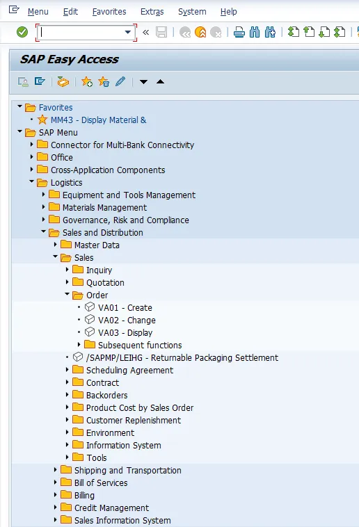
Fiori is a user experience (UX, rather than UI). This means that it is designed with the role in mind, not the function. As an example, let’s take the role “Sales order administrator”. In the traditional SAP GUI, a user with this role would log into SAP and see the entire SAP menu tree, as below, and would need to navigate to the correct path to find the transaction, or remember the transaction or add to their favourites.
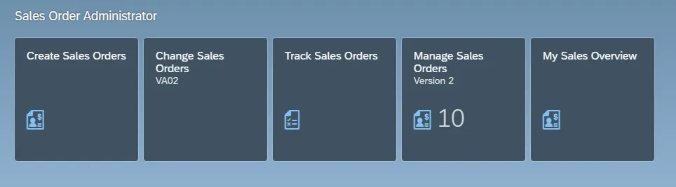
In Fiori, the user experience is designed so that the Sales order administrator role only sees the apps relevant to their role, neatly compartmentalised into pages and spaces, as below:
The other area of a user experience as opposed to a user interface is that Fiori is a design system, not just a technology. What do we mean by this? Let’s explore each of the components which SAP gives us as part of the Fiori design methodology.
Fiori Elements, Floorplans
Have you ever noticed that SAP Fiori apps have the same styling? The same look and feel? How does SAP manage this?
This is controlled via SAP Fiori Elements. Fiori Elements is a toolbox containing guidelines for Fiori design, including SAP Fiori “floorplans”. We’ll get into the guidelines in the next section, but let’s look at what we mean by floorplans.
Floorplans are standardised templates for the visualisation of SAP Fiori apps. There are five standard Fiori floorplans:
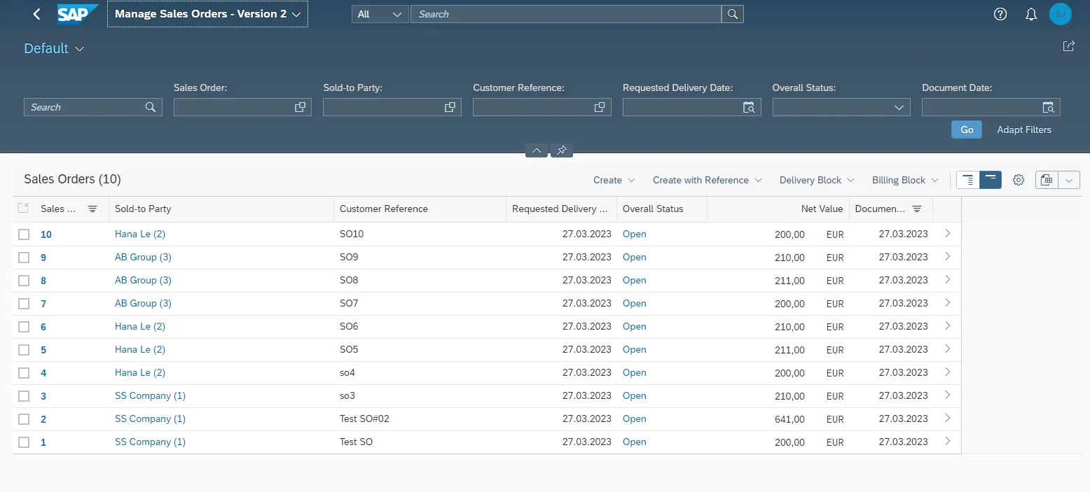
1. List report
List report apps follow a standard page structure which lists out the retrieved data in a set format, as per the example below. This is relevant for large amounts of data where no specific drill-downs are required, and there is the ability to switch between views of data, as well as filter.
2. Worklist
This type of Fiori app is becoming extremely rare and is increasingly being replaced by the list report floorplan. This floorplan presents the data in a list of items for action. No standard filtering or different views of the data are available, so this is a very basic view
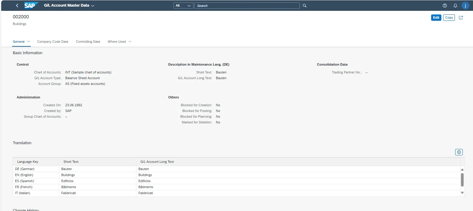
3. Object page
These are often fact-sheet apps, which are navigated to from other apps. Object page apps are very useful for things such as material or customer or vendor master data, where you want to show an overview of the object, but also give flexibility to make amendments.
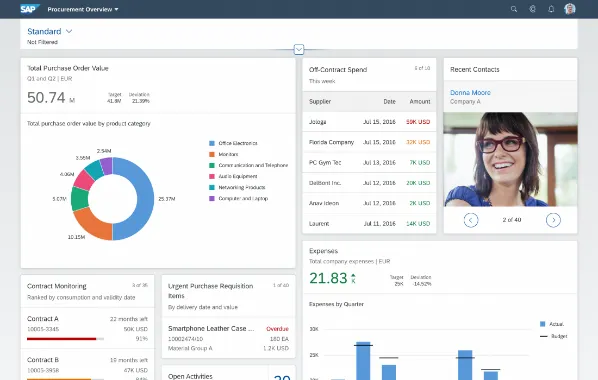
4. Overview page
An overview page is a central hub style page, with dynamic data displayed on “cards”. Each card represents a Fiori app in its own right.
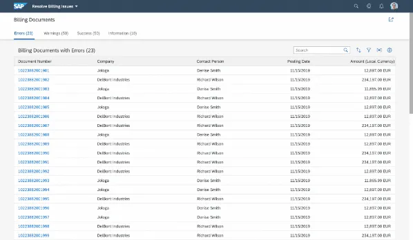
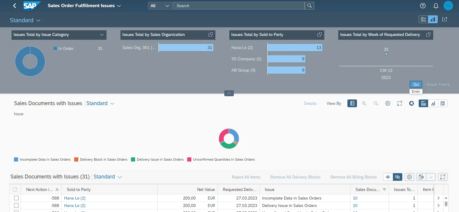
5. Analytical list page
An analytical list page is used to run analysis and root causes of issues. The page is built using graphs and tables and usually refers to data extracted from a CDS (Core Data Services) view in SAP S/4HANA.
Accessibility, Design tokens
Accessibility is all about giving all users the same access to useful information regardless of their situation. Some features of accessibility can be found in the framework level, as pre-built solutions in Fiori launchpad themes. Other features need to be switched on at the app level by navigating to your own profile in Fiori.
More information on accessibility in Fiori can be found here:
https://experience.sap.com/fiori-design-web/accessibility-in-sap-fiori/ for Web Design Guidelines
Design tokens are styles which Fiori uses for colours and themes. By using the same colours and themes in ALL the SAP portfolio of products, SAP ensures that consistency is used. Design tokens are used in all standard Fiori apps. There are three types of design tokens:
• Reference Tokens – contain primary and secondary colours which make up the theme
• Main/Base Tokens – foreground colours to be used in your apps – e.g. sapBrandColor, sapBaseColor, sapHighlightColor, sapTextColor
• Component Tokens – sapButton_Emphasized_Background, sapButton_Emphasized_Hover_Background
Motion Design and UX Illustrations
Standard options exist in Fiori design guidelines for how elements of the Fiori screen change in motion. For example, bringing up a Fiori app often shows the details appearing from top to bottom, like a swipe. This is motion design in action. Fiori offers up a few examples of different motion design settings:
• Immediate Response – hovering over key fields to show the detail immediately. This kind of motion design is used when it is essential for immediate view of the details.
• Small Moves – used where a small wait is acceptable.
• Large Moves – changing data where there is a large amount of data.
• Continuous Animations – this is used to show the shadow of a screen when the system is waiting to render the data. The payload is high, so Fiori takes a little longer.
User experience illustrations for visual elements and messages in Fiori, can also follow standard Fiori guidelines, as below:
• X-small (dot illustrations – size of a flat tile)
• Small (Spot illustrations – same size as a card)
• Medium (dialogue illustrations – size of a standard pop-up box)
• Large (Scene illustrations – take up the whole page)
Text Guidelines
Text guidelines are more design suggestions for Fiori use rather than technical settings to enable. The guidelines should be followed in order to ensure consistency. For example, it is worth not using abbreviations, such as “Qty” for “Quantity” as abbreviations may not make sense for non-English speakers. Additional guidelines include how to use hyphenation, punctuation, formatting, and word choices.
The text guidelines can be found on the SAP website here:
https://experience.sap.com/fiori-design-web/ui-text-guidelines-for-sap-fiori/
More Blogs


